Showing posts with label Duke Addition. Show all posts

Wednesday, April 15, 2015

Oyster Prints & Pantry Progress

Last week I mentioned I ordered these frames for my oyster water color prints, and I have pictures to share! They came in late last week and I hung them over the weekend. We have had a few bad experiences in the past when hanging art grouped together like this and it has been so hard to get everything hung evenly and level. But these were so easy! They came with paper templates, of the exact size of the frames and exactly where to put your nails. It took me all of 5 minutes to tape the templates on the wall, make sure they were straight, and I nailed straight through the paper. I am so happy with how they turned out! I love the way the brushed gold frames pop against the wall color.


In other news, the hubby and my father-in-law got started over the weekend on our new pantry! 

This is the one space in our house that has never functioned well and has probably changed the most (frequently) since we bought our home 6 years ago. I would describe this room as a mud/laundry/pantry/catch- all room. It's not pretty, and we generally keep the door closed to it so we don't have to look at it. To make things worse, when we were building the addition, we found out that our water heater (previously stored in a water closet) was not to code because it was too close to our electrical panel. 

And that brings me to this lovely drawing I made... 


This little nook used to house the above industrial shelves that we used as our pantry and miscellaneous storage, but now holds our water heater on the right side and is no longer big enough for the shelving unit. So we brainstormed for a new pantry solution, in keeping with the layout that we have, and this is what we came up with...


We added bi-fold closet doors and W and his dad framed out and put drywall up for a pantry. You can kind of catch a glimpse on the far right side of the picture of that white cabinet on the wall. It's small and just houses mostly tools and detergent, but it will be coming down so the doors can open properly. Most of that stuff will be moved into what used to house the water heater before we had to move it.


He finished up the drywall this week and now we just need to get shelves put in, and paint the doors and walls to clean up the look. 

It's still not perfect, but it's the best scenario this room as seen to date. W and his dad did a great job of the pantry and when it's all said and done, I think we will really enjoy the new layout. 

Do any of you have a room in your house that just doesn't function properly? What did you do to fix it?  I would love to hear about it!


post signature

Friday, April 3, 2015

Friday Favorites & House Updates


Hey, guess what? It's the friggin' weekend! TGIF, amiright?! 

After wrapping up our new addition, things have started to slow down for the last couple of weeks on the home front, but there is still SO much to be done and April has gotten me motivated to get busy again! 

 Honey- Do (Together) List- 

1. Paint kitchen & dining room - after moving furniture out of these rooms, we realized how badly they need a fresh coat of paint! This is numero uno for me. 

2. Pick up furniture from family that has been storing it for us 

3. Set up & organize guest room 

4. Decorate! Because the kitchen and dining room need to be painted, I removed everything from the walls and am still trying to sort out what & wear things will go back up. Our old spaces felt cluttered and busy to me. I'm still trying to find that balance between a tranquil yet homey feel. 

I did just order two of these frames to hang some watercolor oyster prints I purchased back in December in our master bath, so that's progress right? Baby steps... 


But now that you're all caught up, let's move on to some of my Friday Favs.... 


Kate Marker Interiors

1) This dining room... and anything that involves pastel buffalo check, for that matter. 


John Hummel & Assoc. 

2) white on white on white + brass accents + natural textures (i.e. wood, sisal) = heaven 

casual-spring-time-outfit-idea

3) This outfit inspiration.


Madden Girl 'Digbyy' Ankle Cuff Sandal (Women)


4) These are the perfect neutral sandals but with a fun colorful tassel for just the right amount of spunk in your step. 


Well that's about all I've got for your today... Are you planning to travel this weekend or just staying around home? Either way, I hope everyone has a great Easter weekend! 


post signature

Monday, March 23, 2015

Evolution of Our Living Room


Hi guys! I'm back after taking a couple weeks break to move in (!!!) to our new addition. We are completely done with construction and are now just focusing on filling in the pieces with furniture and accessories. We still have a mile long to-do list but I'm excited to finally share some real progress photos with you! So here is a [condensed] version of the progression of our living room...


post signature

Monday, March 2, 2015

Dining Room Mood Board


Hey ya'll! Wow, I can't believe how fast March snuck up on me!
 So far I've shared with you our master bath mood board, which is coming to life exactly how I imagined it. I'm hoping to share finished pictures with you next week! eeekkkk! We're only waiting on finishing touches now with the mirror and sconces..

I also shared our fireplace inspiration here, which our own fireplace is about 95% finish and I am in LOVE. 

Soo for a lack of "after" pictures, I thought I'd pop in today with a little dining room inspiration for you... 


Dining Room Mood Board


Pre-addition, we didn't have a proper dining room - more like a cramped eat in kitchen. But post-addition we are transforming our old living room into a dining area. We are really excited to finally be trading in our old hand-me-down kitchen table for this new, grown up, and more "us" version. We don't want the dining room to be too formal because this will be our everyday table as well, and most importantly the room needs to be appropriate for a wild toddler to run around in too.  

The room is in dire need of new paint, and I'm in love with BM Seattle Gray (the same color we used in our new bathroom). Still searching for the right dining chairs but I love the stripe details on these - just don't know how well they would hold up with sticky baby fingers :) 
post signature


Get the look...


Wednesday, February 18, 2015

Addition [Updates]


Some exciting things have been happening with the addition progress and I am happy to finally share some quick little snippets with you!

The builder dropped off our mantle on Friday and I am THRILLED with how it looks so far. It will be painted the same color as the rest of the trim in our living room, BM White dove. They also dropped off the carrara marble slab for the hearth, and I'm equally smitten! We're hoping to have the hearth and subway tile surround installed this week.

The bathroom cabinets were also installed last week. The vanity counter top was supposed to come yesterday but this snow storm has thrown yet another wrench in our schedule, so we'll just have to wait and see how things pan out. But as soon as the counter top is in, they can finish the plumbing, install the linen cabinet on top of the vanity, and finally hang the mirror and sconces. 

I just keep reciting to myself...

patience is a virtue
patience is a virtue 


post signature

Tuesday, February 10, 2015

Master Bedroom Mood Board

Master Bedroom Mood Boarf


Things are getting close! Today, the painters are putting the finishing coats on the trim, the electrician is hanging our fixtures and finishing the outlets, and tomorrow our hardwood floors will be sanded and stained. I've felt like a gypsy the last week (going on two now) because we've been hopping from relative to relative's house in order to keep little Harrison away from all of the fumes at home. But we're getting so close now, I can almost taste it! 

Today I put together a little mood board for our master bedroom... 

I like a mix of traditional pieces with contemporary art and accessories. Our bed was actually a wedding gift from my parents and we've used these Restoration Hardware bed linens since our wedding as well, except we just added this linen duvet cover recently for a more lush, layered feel. I ordered custom made, black out, flat roman shades in an off white linen for the window treatments that should be ready in the next couple of weeks. Other than the windows there isn't a lot of new things we need for our master, except I do want new bedside table lamps and art. I'm loving this piece right now, and think it would look amazing over our bed, although I'm worried the size may be a little too small.. but the colors are perfect. 


To see more master bedroom inspiration see here...


post signature


get the look...

Thursday, January 22, 2015

Addition [Paint Color Scheme]


Addition Paint Color Scheme


BM - White Dove // BM - Gentle Gray // BM - Decorators White // BM- Seattle Gray 


I hate painting. 
I can't tell you how many times we've painted a room and after a few weeks (and sometimes even immediately) I have regretted my color choice. Especially when you're married to someone who pretty much thinks paint is a permanent thing in our house...in other words, once it's up, you better like it because it's staying. So the pressure is on. It's time to pick paint colors for our new addition (paint is going on the walls next week... eeek!) 

I've envisioned for some time now the look and feel I want in our new spaces, but picking actual colors that work in actual rooms is so different than seeing a picture in a magazine or on Pinterest and thinking "hey, that's the color I want". So over the past couple of weeks, I've been writing down every gray and white color I think I might like and yesterday I went to the paint shop to get pick up the paint chips. 


After studying all of my picks carefully, I narrowed each room down to 2 or 3 choices and took them home today at lunch to test them out in the middle of the day light in each room. I finally narrowed it down and am soo excited to get them up on the walls and {pray} I still love them as much as I do now! 

Benjamin Moore - White Dove has been my go -to white for a couple years now, and I'm still loving it. And I have been wanting a soothing gray/blue color scheme for a while now and I'm just loving how it is all flowing together.

Do you have a favorite universal paint color? One that you always come back to? I'd love to hear... it's not quite too late to change my mind! ey yi yi....


post signature


Friday, January 16, 2015

Master Bathroom Mood Board

traditional bathroom Decorating the Guest Bath

via


Master Bath Mood Board


sconces //  knobs // pulls // faucet (I found ours at Tuesday Morning a couple years back- thanking myself for holding on to it this long!!) // dried box wood 


It's been a while since I've given ya'll a proper update on our home addition, but trust me when I say things are moving along slowly but surely... 

Insulation and drywall went up this week so we are getting closer to making it look like a real home. And in order to do that there has been a lot of decision making going on along the way. We recently picked out our bathroom cabinets, counter tops, sink, fixtures, and I am now trying to nail down a paint color (I'm leaning towards this subtle gray with blue undertones in BM Bunny Gray...

I'll be back next week with some progress pictures... Have a great weekend! 

post signature

Thursday, December 11, 2014

Duke Addition [Tile Shopping, Pt. 2]

Last week we focused on finalizing our tile choices for the bathroom and the fireplace tile surround. As I mentioned in the last tile shopping post, we decided on a ceramic Carrara Floor Tile Marble for the bathroom floor. I like that it has the look of marble but the durability of ceramic appeals more to me for a bathroom floor (especially considering we have a big dog, and a soon- to- be 1 year old running around under foot). Not to mention the price point hits my fancy. The bathroom tile was an easy decision for us. We were considering the 12x12 or 12x24 size and ultimately have decided to go with the 12x24, laid in a staggered brick pattern. 


As for the fireplace surround, we had a little bit harder time deciding because the options seem to be endless and I like so many different styles. 

Here are some photos I found for inspiration... 


Beautiful millwork on fireplace.

^^love everything about this. 


Simple trim with big impact Hide tv, cable, Internet cords if you can't drill through fireplace brick. my house will have many fire places in it.

^^Love the traditional brick pattern.


family room

^^something a bit darker? 

plaid, tables behind and prints above

Or with no tile at all? 


Fireplace surround in stone beach style by de[luxe] design studio

^^ I love this cozy feel! But maybe a little too craftsmen to fit with our style home..


Carrara Marble hearth with Carrara Marble tile on fireplace. I love the way they changed direction on the running bond pattern.

^^This one just does it all for me. I love how the tile changes direction on the corners.

*images 1, 2, 3, 4, 5 ,6

See? So many beautiful options! How to choose?! 


So we ended up taking these samples home to help us make our decision...


^^3x6 Pearl Tumbled Travertine


^^ 1x2 Arabescato Marble Brick Honed


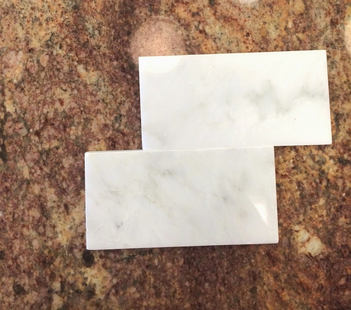
^^ 3x6 Arabescato Polished Marble 

After referring back to our inspiration photos (especially this one) we finally decided on the 3x6 Arabescato Polished Marble!


It's so excited to have some of our finishes picked out and I really am starting to get an overall vision for how the final spaces are going to look. 

***Also on a little side note - the windows and doors were installed on Monday and our new roof is being installed TODAY! Hallelujah, we're back on schedule! 


Thanks for reading!

post signature